 我的书签
我的书签
 添加书签
添加书签 移除书签
移除书签- Notification通知提醒框
- 何时使用
- 代码演示
- API
Notification通知提醒框
全局展示通知提醒信息。
何时使用
在系统四个角显示通知提醒信息。经常用于以下情况:
较为复杂的通知内容。
带有交互的通知,给出用户下一步的行动点。
系统主动推送。
代码演示
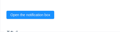
基本
最简单的用法,4.5 秒后自动关闭。
import { Button, notification } from 'antd';const openNotification = () => {notification.open({message: 'Notification Title',description:'This is the content of the notification. This is the content of the notification. This is the content of the notification.',onClick: () => {console.log('Notification Clicked!');},});};ReactDOM.render(<Button type="primary" onClick={openNotification}>Open the notification box</Button>,mountNode,);
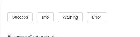
带有图标的通知提醒框
通知提醒框左侧有图标。
import { Button, notification } from 'antd';const openNotificationWithIcon = type => {notification[type]({message: 'Notification Title',description:'This is the content of the notification. This is the content of the notification. This is the content of the notification.',});};ReactDOM.render(<div><Button onClick={() => openNotificationWithIcon('success')}>Success</Button><Button onClick={() => openNotificationWithIcon('info')}>Info</Button><Button onClick={() => openNotificationWithIcon('warning')}>Warning</Button><Button onClick={() => openNotificationWithIcon('error')}>Error</Button></div>,mountNode,);
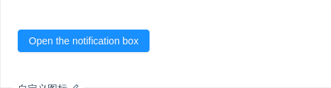
自定义图标
图标可以被自定义。
import { Button, notification, Icon } from 'antd';const openNotification = () => {notification.open({message: 'Notification Title',description:'This is the content of the notification. This is the content of the notification. This is the content of the notification.',icon: <Icon type="smile" style={{ color: '#108ee9' }} />,});};ReactDOM.render(<Button type="primary" onClick={openNotification}>Open the notification box</Button>,mountNode,);

自定义样式
使用 style 和 className 来定义样式。
import { Button, notification } from 'antd';const openNotification = () => {notification.open({message: 'Notification Title',description:'This is the content of the notification. This is the content of the notification. This is the content of the notification.',style: {width: 600,marginLeft: 335 - 600,},});};ReactDOM.render(<Button type="primary" onClick={openNotification}>Open the notification box</Button>,mountNode,);
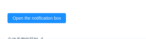
自动关闭的延时
自定义通知框自动关闭的延时,默认4.5s,取消自动关闭只要将该值设为 0 即可。
import { Button, notification } from 'antd';const openNotification = () => {const args = {message: 'Notification Title',description:'I will never close automatically. I will be close automatically. I will never close automatically.',duration: 0,};notification.open(args);};ReactDOM.render(<Button type="primary" onClick={openNotification}>Open the notification box</Button>,mountNode,);
自定义按钮
自定义关闭按钮的样式和文字。
import { Button, notification } from 'antd';const close = () => {console.log('Notification was closed. Either the close button was clicked or duration time elapsed.',);};const openNotification = () => {const key = `open${Date.now()}`;const btn = (<Button type="primary" size="small" onClick={() => notification.close(key)}>Confirm</Button>);notification.open({message: 'Notification Title',description:'A function will be be called after the notification is closed (automatically after the "duration" time of manually).',btn,key,onClose: close,});};ReactDOM.render(<Button type="primary" onClick={openNotification}>Open the notification box</Button>,mountNode,);
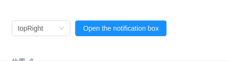
位置
可以设置通知从右上角、右下角、左下角、左上角弹出。
import { Button, Select, notification } from 'antd';const { Option } = Select;const options = ['topLeft', 'topRight', 'bottomLeft', 'bottomRight'];const openNotification = () => {notification.open({message: 'Notification Title',description:'This is the content of the notification. This is the content of the notification. This is the content of the notification.',});};ReactDOM.render(<div><SelectdefaultValue="topRight"style={{ width: 120, marginRight: 10 }}onChange={val => {notification.config({placement: val,});}}>{options.map(val => (<Option key={val} value={val}>{val}</Option>))}</Select><Button type="primary" onClick={openNotification}>Open the notification box</Button></div>,mountNode,);

更新消息内容
可以通过唯一的 key 来更新内容。
import { Button, notification } from 'antd';const key = 'updatable';const openNotification = () => {notification.open({key,message: 'Notification Title',description: 'description.',});setTimeout(() => {notification.open({key,message: 'New Title',description: 'New description.',});}, 1000);};ReactDOM.render(<Button type="primary" onClick={openNotification}>Open the notification box</Button>,mountNode,);
API
notification.success(config)notification.error(config)notification.info(config)notification.warning(config)notification.warn(config)notification.open(config)notification.close(key: String)notification.destroy()
config 参数如下:
| 参数 | 说明 | 类型 | 默认值 |
|---|---|---|---|
| btn | 自定义关闭按钮 | ReactNode | - |
| bottom | 消息从底部弹出时,距离底部的位置,单位像素。 | number | 24 |
| className | 自定义 CSS class | string | - |
| description | 通知提醒内容,必选 | string|ReactNode | - |
| duration | 默认 4.5 秒后自动关闭,配置为 null 则不自动关闭 | number | 4.5 |
| getContainer | 配置渲染节点的输出位置 | () => HTMLNode | () => document.body |
| icon | 自定义图标 | ReactNode | - |
| key | 当前通知唯一标志 | string | - |
| message | 通知提醒标题,必选 | string|ReactNode | - |
| onClose | 点击默认关闭按钮时触发的回调函数 | Function | - |
| onClick | 点击通知时触发的回调函数 | Function | - |
| placement | 弹出位置,可选 topLeft topRight bottomLeft bottomRight | string | topRight |
| style | 自定义内联样式 | React.CSSProperties | - |
| top | 消息从顶部弹出时,距离顶部的位置,单位像素。 | number | 24 |
还提供了一个全局配置方法,在调用前提前配置,全局一次生效。
notification.config(options)
notification.config({placement: 'bottomRight',bottom: 50,duration: 3,});
| 参数 | 说明 | 类型 | 默认值 |
|---|---|---|---|
| bottom | 消息从底部弹出时,距离底部的位置,单位像素。 | number | 24 |
| duration | 默认自动关闭延时,单位秒 | number | 4.5 |
| getContainer | 配置渲染节点的输出位置 | () => HTMLNode | () => document.body |
| placement | 弹出位置,可选 topLeft topRight bottomLeft bottomRight | string | topRight |
| top | 消息从顶部弹出时,距离顶部的位置,单位像素。 | number | 24 |
