 我的书签
我的书签
 添加书签
添加书签 移除书签
移除书签- Alert警告提示
- 何时使用
- 代码演示
- API
Alert警告提示
警告提示,展现需要关注的信息。
何时使用
当某个页面需要向用户显示警告的信息时。
非浮层的静态展现形式,始终展现,不会自动消失,用户可以点击关闭。
代码演示
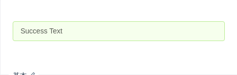
基本
最简单的用法,适用于简短的警告提示。
import { Alert } from 'antd';ReactDOM.render(<Alert message="Success Text" type="success" />, mountNode);
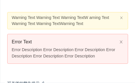
可关闭的警告提示
显示关闭按钮,点击可关闭警告提示。
import { Alert } from 'antd';const onClose = e => {console.log(e, 'I was closed.');};ReactDOM.render(<div><Alertmessage="Warning Text Warning Text Warning TextW arning Text Warning Text Warning TextWarning Text"type="warning"closableonClose={onClose}/><Alertmessage="Error Text"description="Error Description Error Description Error Description Error Description Error Description Error Description"type="error"closableonClose={onClose}/></div>,mountNode,);
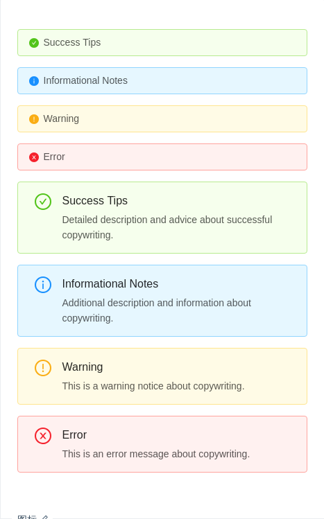
图标
可口的图标让信息类型更加醒目。
import { Alert } from 'antd';ReactDOM.render(<div><Alert message="Success Tips" type="success" showIcon /><Alert message="Informational Notes" type="info" showIcon /><Alert message="Warning" type="warning" showIcon /><Alert message="Error" type="error" showIcon /><Alertmessage="Success Tips"description="Detailed description and advice about successful copywriting."type="success"showIcon/><Alertmessage="Informational Notes"description="Additional description and information about copywriting."type="info"showIcon/><Alertmessage="Warning"description="This is a warning notice about copywriting."type="warning"showIcon/><Alertmessage="Error"description="This is an error message about copywriting."type="error"showIcon/></div>,mountNode,);
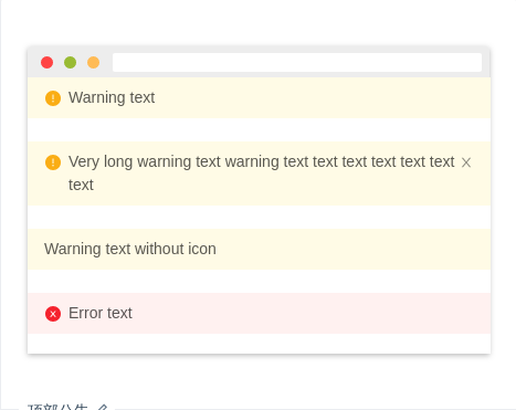
顶部公告
页面顶部通告形式,默认有图标且type 为 'warning'。
import { Alert } from 'antd';ReactDOM.render(<div><Alert message="Warning text" banner /><br /><Alertmessage="Very long warning text warning text text text text text text text"bannerclosable/><br /><Alert showIcon={false} message="Warning text without icon" banner /><br /><Alert type="error" message="Error text" banner /></div>,mountNode,);
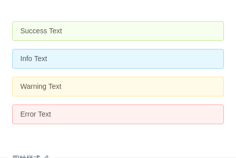
四种样式
共有四种样式 success、info、warning、error。
import { Alert } from 'antd';ReactDOM.render(<div><Alert message="Success Text" type="success" /><Alert message="Info Text" type="info" /><Alert message="Warning Text" type="warning" /><Alert message="Error Text" type="error" /></div>,mountNode,);
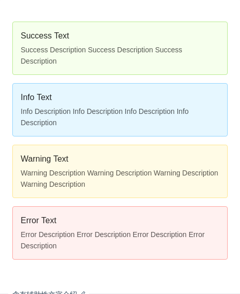
含有辅助性文字介绍
含有辅助性文字介绍的警告提示。
import { Alert } from 'antd';ReactDOM.render(<div><Alertmessage="Success Text"description="Success Description Success Description Success Description"type="success"/><Alertmessage="Info Text"description="Info Description Info Description Info Description Info Description"type="info"/><Alertmessage="Warning Text"description="Warning Description Warning Description Warning Description Warning Description"type="warning"/><Alertmessage="Error Text"description="Error Description Error Description Error Description Error Description"type="error"/></div>,mountNode,);
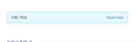
自定义关闭
可以自定义关闭,自定义的文字会替换原先的关闭 Icon。
import { Alert } from 'antd';ReactDOM.render(<Alert message="Info Text" type="info" closeText="Close Now" />, mountNode);
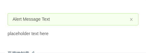
平滑地卸载
平滑、自然的卸载提示。
import { Alert } from 'antd';class App extends React.Component {state = {visible: true,};handleClose = () => {this.setState({ visible: false });};render() {return (<div>{this.state.visible ? (<Alertmessage="Alert Message Text"type="success"closableafterClose={this.handleClose}/>) : null}<p>placeholder text here</p></div>);}}ReactDOM.render(<App />, mountNode);
API
| 参数 | 说明 | 类型 | 默认值 |
|---|---|---|---|
| afterClose | 关闭动画结束后触发的回调函数 | () => void | - |
| banner | 是否用作顶部公告 | boolean | false |
| closable | 默认不显示关闭按钮 | boolean | 无 |
| closeText | 自定义关闭按钮 | string|ReactNode | 无 |
| description | 警告提示的辅助性文字介绍 | string|ReactNode | 无 |
| icon | 自定义图标,showIcon 为 true 时有效 | ReactNode | - |
| message | 警告提示内容 | string|ReactNode | 无 |
| showIcon | 是否显示辅助图标 | boolean | false,banner 模式下默认值为 true |
| type | 指定警告提示的样式,有四种选择 success、info、warning、error | string | info,banner 模式下默认值为 warning |
| onClose | 关闭时触发的回调函数 | (e: MouseEvent) => void | 无 |
