 我的书签
我的书签
 添加书签
添加书签 移除书签
移除书签- Tabs标签页
- 何时使用
- 代码演示
- API
- Tabs
- Tabs.TabPane
Tabs标签页
选项卡切换组件。
何时使用
提供平级的区域将大块内容进行收纳和展现,保持界面整洁。
Ant Design 依次提供了三级选项卡,分别用于不同的场景。
卡片式的页签,提供可关闭的样式,常用于容器顶部。
标准线条式页签,用于容器内部的主功能切换,这是最常用的 Tabs。
RadioButton 可作为更次级的页签来使用。
代码演示
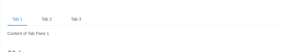
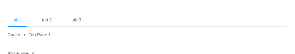
基本
默认选中第一项。
import { Tabs } from 'antd';const TabPane = Tabs.TabPane;function callback(key) {console.log(key);}ReactDOM.render(<Tabs defaultActiveKey="1" onChange={callback}><TabPane tab="Tab 1" key="1">Content of Tab Pane 1</TabPane><TabPane tab="Tab 2" key="2">Content of Tab Pane 2</TabPane><TabPane tab="Tab 3" key="3">Content of Tab Pane 3</TabPane></Tabs>,mountNode,);
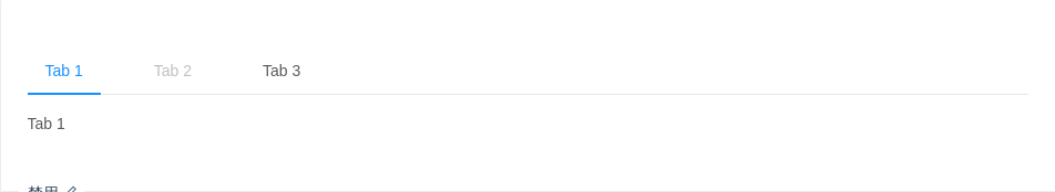
禁用
禁用某一项。
import { Tabs } from 'antd';const TabPane = Tabs.TabPane;ReactDOM.render(<Tabs defaultActiveKey="1"><TabPane tab="Tab 1" key="1">Tab 1</TabPane><TabPane tab="Tab 2" disabled key="2">Tab 2</TabPane><TabPane tab="Tab 3" key="3">Tab 3</TabPane></Tabs>,mountNode,);
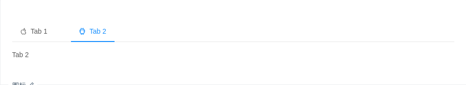
图标
有图标的标签。
import { Tabs, Icon } from 'antd';const TabPane = Tabs.TabPane;ReactDOM.render(<Tabs defaultActiveKey="2"><TabPanetab={<span><Icon type="apple" />Tab 1</span>}key="1">Tab 1</TabPane><TabPanetab={<span><Icon type="android" />Tab 2</span>}key="2">Tab 2</TabPane></Tabs>,mountNode,);
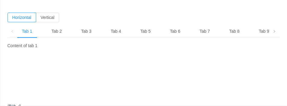
滑动
可以左右、上下滑动,容纳更多标签。
import { Tabs, Radio } from 'antd';const TabPane = Tabs.TabPane;class SlidingTabsDemo extends React.Component {constructor(props) {super(props);this.state = {mode: 'top',};}handleModeChange = e => {const mode = e.target.value;this.setState({ mode });};render() {const { mode } = this.state;return (<div><Radio.Group onChange={this.handleModeChange} value={mode} style={{ marginBottom: 8 }}><Radio.Button value="top">Horizontal</Radio.Button><Radio.Button value="left">Vertical</Radio.Button></Radio.Group><Tabs defaultActiveKey="1" tabPosition={mode} style={{ height: 220 }}><TabPane tab="Tab 1" key="1">Content of tab 1</TabPane><TabPane tab="Tab 2" key="2">Content of tab 2</TabPane><TabPane tab="Tab 3" key="3">Content of tab 3</TabPane><TabPane tab="Tab 4" key="4">Content of tab 4</TabPane><TabPane tab="Tab 5" key="5">Content of tab 5</TabPane><TabPane tab="Tab 6" key="6">Content of tab 6</TabPane><TabPane tab="Tab 7" key="7">Content of tab 7</TabPane><TabPane tab="Tab 8" key="8">Content of tab 8</TabPane><TabPane tab="Tab 9" key="9">Content of tab 9</TabPane><TabPane tab="Tab 10" key="10">Content of tab 10</TabPane><TabPane tab="Tab 11" key="11">Content of tab 11</TabPane></Tabs></div>);}}ReactDOM.render(<SlidingTabsDemo />, mountNode);
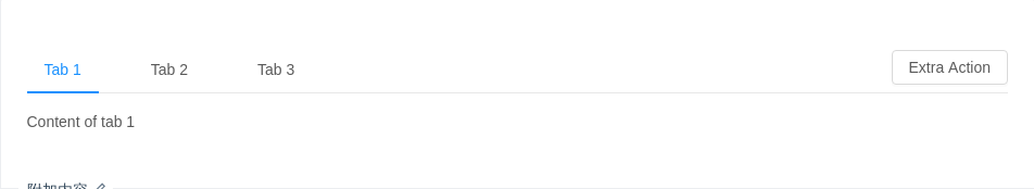
附加内容
可以在页签右边添加附加操作。
import { Tabs, Button } from 'antd';const TabPane = Tabs.TabPane;const operations = <Button>Extra Action</Button>;ReactDOM.render(<Tabs tabBarExtraContent={operations}><TabPane tab="Tab 1" key="1">Content of tab 1</TabPane><TabPane tab="Tab 2" key="2">Content of tab 2</TabPane><TabPane tab="Tab 3" key="3">Content of tab 3</TabPane></Tabs>,mountNode,);
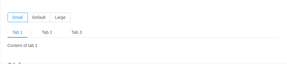
大小
大号页签用在页头区域,小号用在弹出框等较狭窄的容器内。
import { Tabs, Radio } from 'antd';const { TabPane } = Tabs;class Demo extends React.Component {state = { size: 'small' };onChange = e => {this.setState({ size: e.target.value });};render() {const { size } = this.state;return (<div><Radio.Group value={size} onChange={this.onChange} style={{ marginBottom: 16 }}><Radio.Button value="small">Small</Radio.Button><Radio.Button value="default">Default</Radio.Button><Radio.Button value="large">Large</Radio.Button></Radio.Group><Tabs defaultActiveKey="1" size={size}><TabPane tab="Tab 1" key="1">Content of tab 1</TabPane><TabPane tab="Tab 2" key="2">Content of tab 2</TabPane><TabPane tab="Tab 3" key="3">Content of tab 3</TabPane></Tabs></div>);}}ReactDOM.render(<Demo />, mountNode);
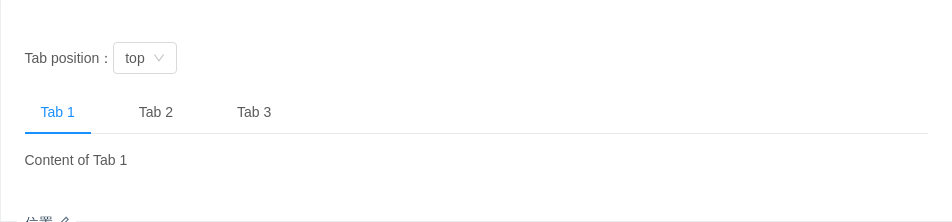
位置
有四个位置,tabPosition="left|right|top|bottom"。
import { Tabs, Select } from 'antd';const TabPane = Tabs.TabPane;const Option = Select.Option;class Demo extends React.Component {state = {tabPosition: 'top',};changeTabPosition = tabPosition => {this.setState({ tabPosition });};render() {return (<div><div style={{ marginBottom: 16 }}>Tab position:<Selectvalue={this.state.tabPosition}onChange={this.changeTabPosition}dropdownMatchSelectWidth={false}><Option value="top">top</Option><Option value="bottom">bottom</Option><Option value="left">left</Option><Option value="right">right</Option></Select></div><Tabs tabPosition={this.state.tabPosition}><TabPane tab="Tab 1" key="1">Content of Tab 1</TabPane><TabPane tab="Tab 2" key="2">Content of Tab 2</TabPane><TabPane tab="Tab 3" key="3">Content of Tab 3</TabPane></Tabs></div>);}}ReactDOM.render(<Demo />, mountNode);
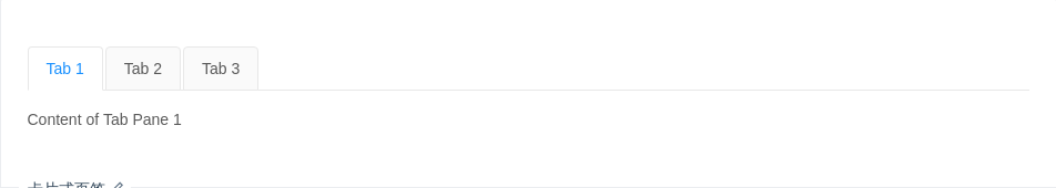
卡片式页签
另一种样式的页签,不提供对应的垂直样式。
import { Tabs } from 'antd';const TabPane = Tabs.TabPane;function callback(key) {console.log(key);}ReactDOM.render(<Tabs onChange={callback} type="card"><TabPane tab="Tab 1" key="1">Content of Tab Pane 1</TabPane><TabPane tab="Tab 2" key="2">Content of Tab Pane 2</TabPane><TabPane tab="Tab 3" key="3">Content of Tab Pane 3</TabPane></Tabs>,mountNode,);
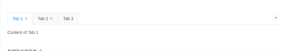
新增和关闭页签
只有卡片样式的页签支持新增和关闭选项。使用 closable={false} 禁止关闭。
import { Tabs } from 'antd';const TabPane = Tabs.TabPane;class Demo extends React.Component {constructor(props) {super(props);this.newTabIndex = 0;const panes = [{ title: 'Tab 1', content: 'Content of Tab 1', key: '1' },{ title: 'Tab 2', content: 'Content of Tab 2', key: '2' },{title: 'Tab 3',content: 'Content of Tab 3',key: '3',closable: false,},];this.state = {activeKey: panes[0].key,panes,};}onChange = activeKey => {this.setState({ activeKey });};onEdit = (targetKey, action) => {this[action](targetKey);};add = () => {const panes = this.state.panes;const activeKey = `newTab${this.newTabIndex++}`;panes.push({ title: 'New Tab', content: 'Content of new Tab', key: activeKey });this.setState({ panes, activeKey });};remove = targetKey => {let activeKey = this.state.activeKey;let lastIndex;this.state.panes.forEach((pane, i) => {if (pane.key === targetKey) {lastIndex = i - 1;}});const panes = this.state.panes.filter(pane => pane.key !== targetKey);if (panes.length && activeKey === targetKey) {if (lastIndex >= 0) {activeKey = panes[lastIndex].key;} else {activeKey = panes[0].key;}}this.setState({ panes, activeKey });};render() {return (<TabsonChange={this.onChange}activeKey={this.state.activeKey}type="editable-card"onEdit={this.onEdit}>{this.state.panes.map(pane => (<TabPane tab={pane.title} key={pane.key} closable={pane.closable}>{pane.content}</TabPane>))}</Tabs>);}}ReactDOM.render(<Demo />, mountNode);
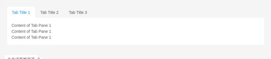
卡片式页签容器
用于容器顶部,需要一点额外的样式覆盖。
import { Tabs } from 'antd';const TabPane = Tabs.TabPane;ReactDOM.render(<div className="card-container"><Tabs type="card"><TabPane tab="Tab Title 1" key="1"><p>Content of Tab Pane 1</p><p>Content of Tab Pane 1</p><p>Content of Tab Pane 1</p></TabPane><TabPane tab="Tab Title 2" key="2"><p>Content of Tab Pane 2</p><p>Content of Tab Pane 2</p><p>Content of Tab Pane 2</p></TabPane><TabPane tab="Tab Title 3" key="3"><p>Content of Tab Pane 3</p><p>Content of Tab Pane 3</p><p>Content of Tab Pane 3</p></TabPane></Tabs></div>,mountNode,);
.card-container > .ant-tabs-card > .ant-tabs-content {height: 120px;margin-top: -16px;}.card-container > .ant-tabs-card > .ant-tabs-content > .ant-tabs-tabpane {background: #fff;padding: 16px;}.card-container > .ant-tabs-card > .ant-tabs-bar {border-color: #fff;}.card-container > .ant-tabs-card > .ant-tabs-bar .ant-tabs-tab {border-color: transparent;background: transparent;}.card-container > .ant-tabs-card > .ant-tabs-bar .ant-tabs-tab-active {border-color: #fff;background: #fff;}
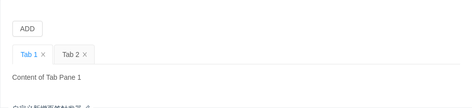
自定义新增页签触发器
隐藏默认的页签增加图标,给自定义触发器绑定事件。
import { Tabs, Button } from 'antd';const TabPane = Tabs.TabPane;class Demo extends React.Component {constructor(props) {super(props);this.newTabIndex = 0;const panes = [{ title: 'Tab 1', content: 'Content of Tab Pane 1', key: '1' },{ title: 'Tab 2', content: 'Content of Tab Pane 2', key: '2' },];this.state = {activeKey: panes[0].key,panes,};}onChange = activeKey => {this.setState({ activeKey });};onEdit = (targetKey, action) => {this[action](targetKey);};add = () => {const panes = this.state.panes;const activeKey = `newTab${this.newTabIndex++}`;panes.push({ title: 'New Tab', content: 'New Tab Pane', key: activeKey });this.setState({ panes, activeKey });};remove = targetKey => {let activeKey = this.state.activeKey;let lastIndex;this.state.panes.forEach((pane, i) => {if (pane.key === targetKey) {lastIndex = i - 1;}});const panes = this.state.panes.filter(pane => pane.key !== targetKey);if (panes.length && activeKey === targetKey) {if (lastIndex >= 0) {activeKey = panes[lastIndex].key;} else {activeKey = panes[0].key;}}this.setState({ panes, activeKey });};render() {return (<div><div style={{ marginBottom: 16 }}><Button onClick={this.add}>ADD</Button></div><TabshideAddonChange={this.onChange}activeKey={this.state.activeKey}type="editable-card"onEdit={this.onEdit}>{this.state.panes.map(pane => (<TabPane tab={pane.title} key={pane.key}>{pane.content}</TabPane>))}</Tabs></div>);}}ReactDOM.render(<Demo />, mountNode);
自定义页签头
使用 react-sticky 组件实现吸顶效果。
import { Tabs } from 'antd';import { StickyContainer, Sticky } from 'react-sticky';const TabPane = Tabs.TabPane;const renderTabBar = (props, DefaultTabBar) => (<Sticky bottomOffset={80}>{({ style }) => (<DefaultTabBar {...props} style={{ ...style, zIndex: 1, background: '#fff' }} />)}</Sticky>);ReactDOM.render(<StickyContainer><Tabs defaultActiveKey="1" renderTabBar={renderTabBar}><TabPane tab="Tab 1" key="1" style={{ height: 200 }}>Content of Tab Pane 1</TabPane><TabPane tab="Tab 2" key="2">Content of Tab Pane 2</TabPane><TabPane tab="Tab 3" key="3">Content of Tab Pane 3</TabPane></Tabs></StickyContainer>,mountNode,);
可拖拽标签
使用 react-dnd 实现标签可拖拽。
import { Tabs } from 'antd';import { DragDropContextProvider, DragSource, DropTarget } from 'react-dnd';import HTML5Backend from 'react-dnd-html5-backend';const TabPane = Tabs.TabPane;// Drag & Drop nodeclass TabNode extends React.Component {render() {const { connectDragSource, connectDropTarget, children } = this.props;return connectDragSource(connectDropTarget(children));}}const cardTarget = {drop(props, monitor) {const dragKey = monitor.getItem().index;const hoverKey = props.index;if (dragKey === hoverKey) {return;}props.moveTabNode(dragKey, hoverKey);monitor.getItem().index = hoverKey;},};const cardSource = {beginDrag(props) {return {id: props.id,index: props.index,};},};const WrapTabNode = DropTarget('DND_NODE', cardTarget, connect => ({connectDropTarget: connect.dropTarget(),}))(DragSource('DND_NODE', cardSource, (connect, monitor) => ({connectDragSource: connect.dragSource(),isDragging: monitor.isDragging(),}))(TabNode),);class DraggableTabs extends React.Component {state = {order: [],};moveTabNode = (dragKey, hoverKey) => {const newOrder = this.state.order.slice();const { children } = this.props;React.Children.forEach(children, c => {if (newOrder.indexOf(c.key) === -1) {newOrder.push(c.key);}});const dragIndex = newOrder.indexOf(dragKey);const hoverIndex = newOrder.indexOf(hoverKey);newOrder.splice(dragIndex, 1);newOrder.splice(hoverIndex, 0, dragKey);this.setState({order: newOrder,});};renderTabBar = (props, DefaultTabBar) => (<DefaultTabBar {...props}>{node => (<WrapTabNode key={node.key} index={node.key} moveTabNode={this.moveTabNode}>{node}</WrapTabNode>)}</DefaultTabBar>);render() {const { order } = this.state;const { children } = this.props;const tabs = [];React.Children.forEach(children, c => {tabs.push(c);});const orderTabs = tabs.slice().sort((a, b) => {const orderA = order.indexOf(a.key);const orderB = order.indexOf(b.key);if (orderA !== -1 && orderB !== -1) {return orderA - orderB;}if (orderA !== -1) {return -1;}if (orderB !== -1) {return 1;}const ia = tabs.indexOf(a);const ib = tabs.indexOf(b);return ia - ib;});return (<DragDropContextProvider backend={HTML5Backend}><Tabs renderTabBar={this.renderTabBar} {...this.props}>{orderTabs}</Tabs></DragDropContextProvider>);}}ReactDOM.render(<DraggableTabs><TabPane tab="tab 1" key="1">Content of Tab Pane 1</TabPane><TabPane tab="tab 2" key="2">Content of Tab Pane 2</TabPane><TabPane tab="tab 3" key="3">Content of Tab Pane 3</TabPane></DraggableTabs>,mountNode,);
API
Tabs
| 参数 | 说明 | 类型 | 默认值 |
|---|---|---|---|
| activeKey | 当前激活 tab 面板的 key | string | 无 |
| animated | 是否使用动画切换 Tabs,在 tabPosition=top|bottom 时有效 | boolean | {inkBar:boolean, tabPane:boolean} | true, 当 type="card" 时为 false |
| renderTabBar | 替换 TabBar,用于二次封装标签头 | (props: DefaultTabBarProps, DefaultTabBar: React.ReactNode) => React.ReactNode | 无 |
| defaultActiveKey | 初始化选中面板的 key,如果没有设置 activeKey | string | 第一个面板 |
| hideAdd | 是否隐藏加号图标,在 type="editable-card" 时有效 | boolean | false |
| size | 大小,提供 large default 和 small 三种大小 | string | 'default' |
| tabBarExtraContent | tab bar 上额外的元素 | React.ReactNode | 无 |
| tabBarGutter | tabs 之间的间隙 | number | 无 |
| tabBarStyle | tab bar 的样式对象 | object | - |
| tabPosition | 页签位置,可选值有 top right bottom left | string | 'top' |
| type | 页签的基本样式,可选 line、card editable-card 类型 | string | 'line' |
| onChange | 切换面板的回调 | Function(activeKey) {} | 无 |
| onEdit | 新增和删除页签的回调,在 type="editable-card" 时有效 | (targetKey, action): void | 无 |
| onNextClick | next 按钮被点击的回调 | Function | 无 |
| onPrevClick | prev 按钮被点击的回调 | Function | 无 |
| onTabClick | tab 被点击的回调 | Function | 无 |
Tabs.TabPane
| 参数 | 说明 | 类型 | 默认值 |
|---|---|---|---|
| forceRender | 被隐藏时是否渲染 DOM 结构 | boolean | false |
| key | 对应 activeKey | string | 无 |
| tab | 选项卡头显示文字 | string|ReactNode | 无 |
