 我的书签
我的书签
 添加书签
添加书签 移除书签
移除书签- List列表
- 何时使用
- 代码演示
- API
- List
- pagination
- List grid props
- List.Item
- List.Item.Meta
List列表
通用列表。
何时使用
最基础的列表展示,可承载文字、列表、图片、段落,常用于后台数据展示页面。
代码演示
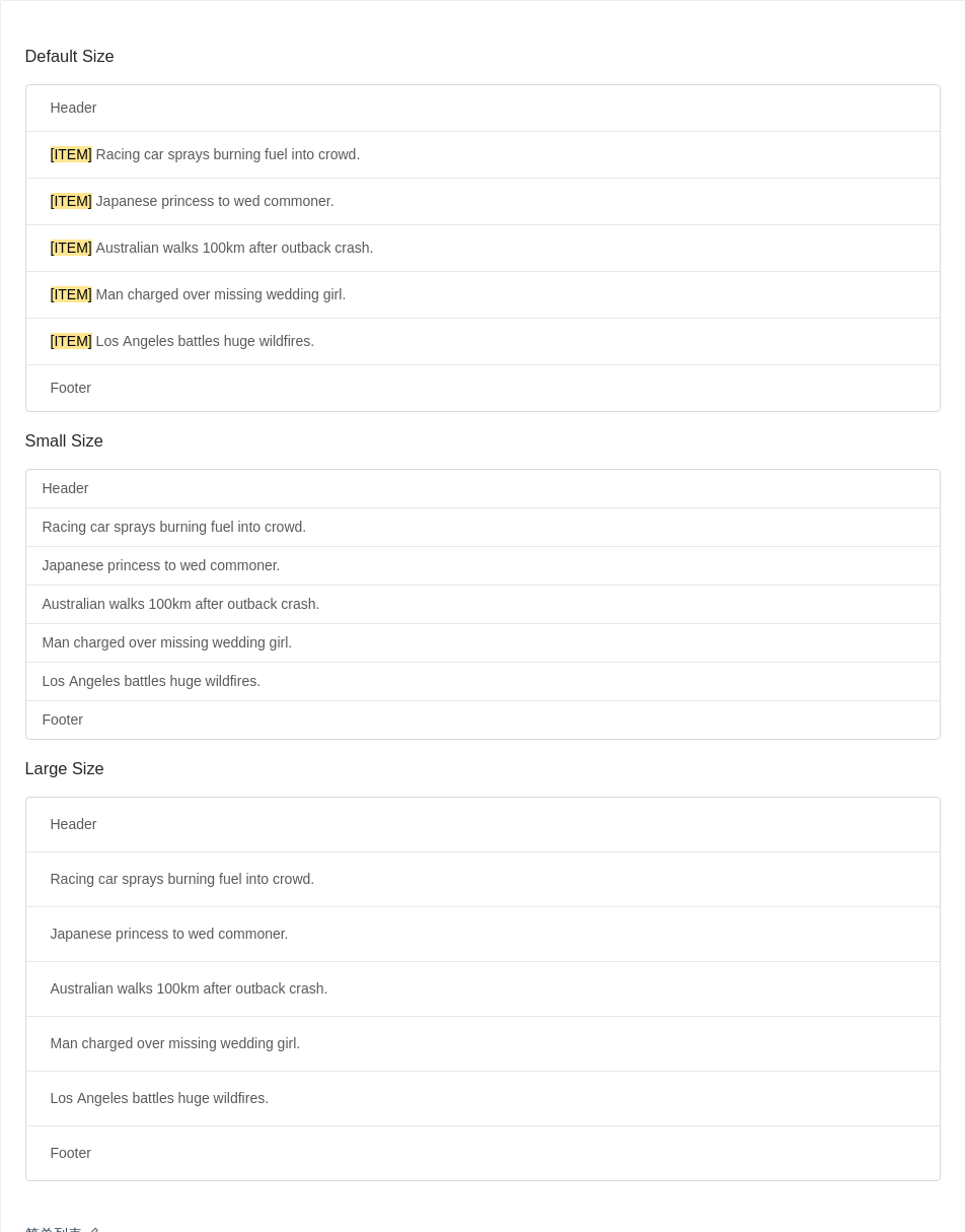
简单列表
列表拥有大、中、小三种尺寸。
通过设置 size 为 large small 分别把按钮设为大、小尺寸。若不设置 size,则尺寸为中。
可通过设置 header 和 footer,来自定义列表头部和尾部。
import { List, Typography } from 'antd';const data = ['Racing car sprays burning fuel into crowd.','Japanese princess to wed commoner.','Australian walks 100km after outback crash.','Man charged over missing wedding girl.','Los Angeles battles huge wildfires.',];ReactDOM.render(<div><h3 style={{ marginBottom: 16 }}>Default Size</h3><Listheader={<div>Header</div>}footer={<div>Footer</div>}bordereddataSource={data}renderItem={item => (<List.Item><Typography.Text mark>[ITEM]</Typography.Text> {item}</List.Item>)}/><h3 style={{ margin: '16px 0' }}>Small Size</h3><Listsize="small"header={<div>Header</div>}footer={<div>Footer</div>}bordereddataSource={data}renderItem={item => <List.Item>{item}</List.Item>}/><h3 style={{ margin: '16px 0' }}>Large Size</h3><Listsize="large"header={<div>Header</div>}footer={<div>Footer</div>}bordereddataSource={data}renderItem={item => <List.Item>{item}</List.Item>}/></div>,mountNode,);
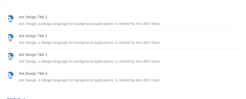
基础列表
基础列表。
import { List, Avatar } from 'antd';const data = [{title: 'Ant Design Title 1',},{title: 'Ant Design Title 2',},{title: 'Ant Design Title 3',},{title: 'Ant Design Title 4',},];ReactDOM.render(<ListitemLayout="horizontal"dataSource={data}renderItem={item => (<List.Item><List.Item.Metaavatar={<Avatar src="https://zos.alipayobjects.com/rmsportal/ODTLcjxAfvqbxHnVXCYX.png" />}title={<a href="https://ant.design">{item.title}</a>}description="Ant Design, a design language for background applications, is refined by Ant UED Team"/></List.Item>)}/>,mountNode,);
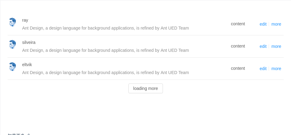
加载更多
可通过 loadMore 属性实现加载更多功能。
import { List, Avatar, Button, Skeleton } from 'antd';import reqwest from 'reqwest';const count = 3;const fakeDataUrl = `https://randomuser.me/api/?results=${count}&inc=name,gender,email,nat&noinfo`;class LoadMoreList extends React.Component {state = {initLoading: true,loading: false,data: [],list: [],};componentDidMount() {this.getData(res => {this.setState({initLoading: false,data: res.results,list: res.results,});});}getData = callback => {reqwest({url: fakeDataUrl,type: 'json',method: 'get',contentType: 'application/json',success: res => {callback(res);},});};onLoadMore = () => {this.setState({loading: true,list: this.state.data.concat([...new Array(count)].map(() => ({ loading: true, name: {} }))),});this.getData(res => {const data = this.state.data.concat(res.results);this.setState({data,list: data,loading: false,},() => {// Resetting window's offsetTop so as to display react-virtualized demo underfloor.// In real scene, you can using public method of react-virtualized:// https://stackoverflow.com/questions/46700726/how-to-use-public-method-updateposition-of-react-virtualizedwindow.dispatchEvent(new Event('resize'));},);});};render() {const { initLoading, loading, list } = this.state;const loadMore =!initLoading && !loading ? (<divstyle={{textAlign: 'center',marginTop: 12,height: 32,lineHeight: '32px',}}><Button onClick={this.onLoadMore}>loading more</Button></div>) : null;return (<ListclassName="demo-loadmore-list"loading={initLoading}itemLayout="horizontal"loadMore={loadMore}dataSource={list}renderItem={item => (<List.Item actions={[<a>edit</a>, <a>more</a>]}><Skeleton avatar title={false} loading={item.loading} active><List.Item.Metaavatar={<Avatar src="https://zos.alipayobjects.com/rmsportal/ODTLcjxAfvqbxHnVXCYX.png" />}title={<a href="https://ant.design">{item.name.last}</a>}description="Ant Design, a design language for background applications, is refined by Ant UED Team"/><div>content</div></Skeleton></List.Item>)}/>);}}ReactDOM.render(<LoadMoreList />, mountNode);
.demo-loadmore-list {min-height: 350px;}
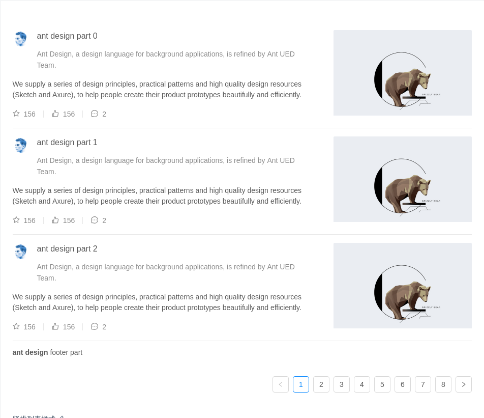
竖排列表样式
通过设置 itemLayout 属性为 vertical 可实现竖排列表样式。
import { List, Avatar, Icon } from 'antd';const listData = [];for (let i = 0; i < 23; i++) {listData.push({href: 'http://ant.design',title: `ant design part ${i}`,avatar: 'https://zos.alipayobjects.com/rmsportal/ODTLcjxAfvqbxHnVXCYX.png',description:'Ant Design, a design language for background applications, is refined by Ant UED Team.',content:'We supply a series of design principles, practical patterns and high quality design resources (Sketch and Axure), to help people create their product prototypes beautifully and efficiently.',});}const IconText = ({ type, text }) => (<span><Icon type={type} style={{ marginRight: 8 }} />{text}</span>);ReactDOM.render(<ListitemLayout="vertical"size="large"pagination={{onChange: page => {console.log(page);},pageSize: 3,}}dataSource={listData}footer={<div><b>ant design</b> footer part</div>}renderItem={item => (<List.Itemkey={item.title}actions={[<IconText type="star-o" text="156" />,<IconText type="like-o" text="156" />,<IconText type="message" text="2" />,]}extra={<imgwidth={272}alt="logo"src="https://gw.alipayobjects.com/zos/rmsportal/mqaQswcyDLcXyDKnZfES.png"/>}><List.Item.Metaavatar={<Avatar src={item.avatar} />}title={<a href={item.href}>{item.title}</a>}description={item.description}/>{item.content}</List.Item>)}/>,mountNode,);
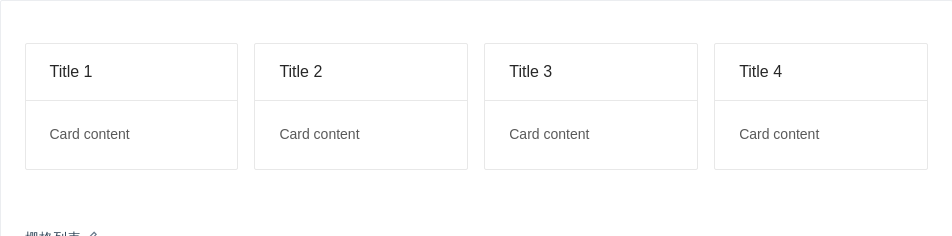
栅格列表
可以通过设置 List 的 grid 属性来实现栅格列表,column 可设置期望显示的列数。
import { List, Card } from 'antd';const data = [{title: 'Title 1',},{title: 'Title 2',},{title: 'Title 3',},{title: 'Title 4',},];ReactDOM.render(<Listgrid={{ gutter: 16, column: 4 }}dataSource={data}renderItem={item => (<List.Item><Card title={item.title}>Card content</Card></List.Item>)}/>,mountNode,);
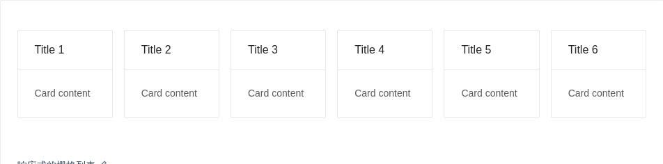
响应式的栅格列表
响应式的栅格列表。尺寸与 Layout Grid 保持一致。
import { List, Card } from 'antd';const data = [{title: 'Title 1',},{title: 'Title 2',},{title: 'Title 3',},{title: 'Title 4',},{title: 'Title 5',},{title: 'Title 6',},];ReactDOM.render(<Listgrid={{gutter: 16,xs: 1,sm: 2,md: 4,lg: 4,xl: 6,xxl: 3,}}dataSource={data}renderItem={item => (<List.Item><Card title={item.title}>Card content</Card></List.Item>)}/>,mountNode,);
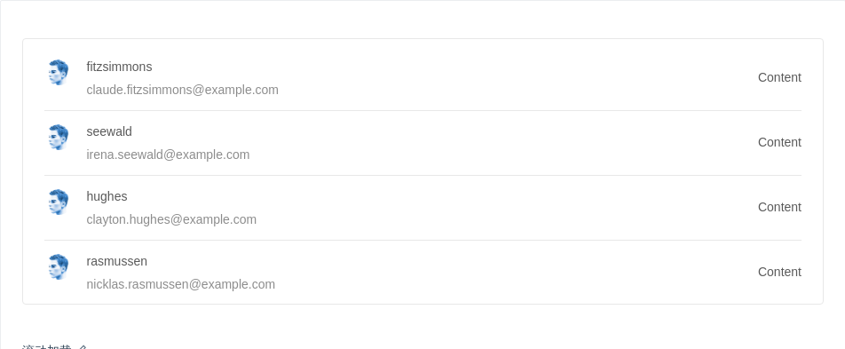
滚动加载
结合 react-infinite-scroller 实现滚动自动加载列表。
import { List, message, Avatar, Spin } from 'antd';import reqwest from 'reqwest';import InfiniteScroll from 'react-infinite-scroller';const fakeDataUrl = 'https://randomuser.me/api/?results=5&inc=name,gender,email,nat&noinfo';class InfiniteListExample extends React.Component {state = {data: [],loading: false,hasMore: true,};componentDidMount() {this.fetchData(res => {this.setState({data: res.results,});});}fetchData = callback => {reqwest({url: fakeDataUrl,type: 'json',method: 'get',contentType: 'application/json',success: res => {callback(res);},});};handleInfiniteOnLoad = () => {let data = this.state.data;this.setState({loading: true,});if (data.length > 14) {message.warning('Infinite List loaded all');this.setState({hasMore: false,loading: false,});return;}this.fetchData(res => {data = data.concat(res.results);this.setState({data,loading: false,});});};render() {return (<div className="demo-infinite-container"><InfiniteScrollinitialLoad={false}pageStart={0}loadMore={this.handleInfiniteOnLoad}hasMore={!this.state.loading && this.state.hasMore}useWindow={false}><ListdataSource={this.state.data}renderItem={item => (<List.Item key={item.id}><List.Item.Metaavatar={<Avatar src="https://zos.alipayobjects.com/rmsportal/ODTLcjxAfvqbxHnVXCYX.png" />}title={<a href="https://ant.design">{item.name.last}</a>}description={item.email}/><div>Content</div></List.Item>)}>{this.state.loading && this.state.hasMore && (<div className="demo-loading-container"><Spin /></div>)}</List></InfiniteScroll></div>);}}ReactDOM.render(<InfiniteListExample />, mountNode);
.demo-infinite-container {border: 1px solid #e8e8e8;border-radius: 4px;overflow: auto;padding: 8px 24px;height: 300px;}.demo-loading-container {position: absolute;bottom: 40px;width: 100%;text-align: center;}
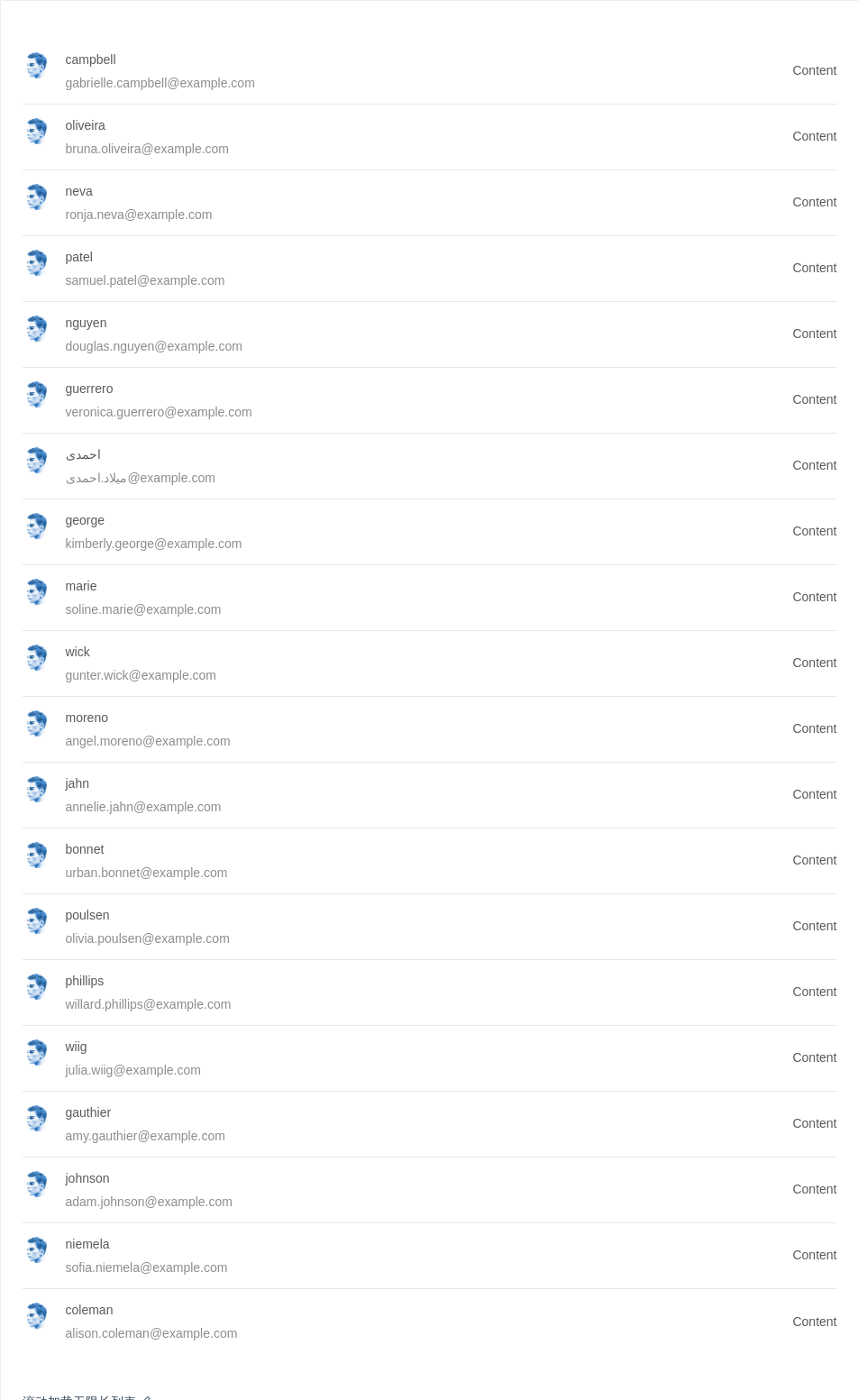
滚动加载无限长列表
结合 react-virtualized 实现滚动加载无限长列表,带有虚拟化(virtualization)功能,能够提高数据量大时候长列表的性能。
virtualized 是在大数据列表中应用的一种技术,主要是为了减少不可见区域不必要的渲染从而提高性能,特别是数据量在成千上万条效果尤为明显。了解更多
import { List, message, Avatar, Spin } from 'antd';import reqwest from 'reqwest';import WindowScroller from 'react-virtualized/dist/commonjs/WindowScroller';import AutoSizer from 'react-virtualized/dist/commonjs/AutoSizer';import VList from 'react-virtualized/dist/commonjs/List';import InfiniteLoader from 'react-virtualized/dist/commonjs/InfiniteLoader';const fakeDataUrl = 'https://randomuser.me/api/?results=5&inc=name,gender,email,nat&noinfo';class VirtualizedExample extends React.Component {state = {data: [],loading: false,};loadedRowsMap = {};componentDidMount() {this.fetchData(res => {this.setState({data: res.results,});});}fetchData = callback => {reqwest({url: fakeDataUrl,type: 'json',method: 'get',contentType: 'application/json',success: res => {callback(res);},});};handleInfiniteOnLoad = ({ startIndex, stopIndex }) => {let data = this.state.data;this.setState({loading: true,});for (let i = startIndex; i <= stopIndex; i++) {// 1 means loadingthis.loadedRowsMap[i] = 1;}if (data.length > 19) {message.warning('Virtualized List loaded all');this.setState({loading: false,});return;}this.fetchData(res => {data = data.concat(res.results);this.setState({data,loading: false,});});};isRowLoaded = ({ index }) => !!this.loadedRowsMap[index];renderItem = ({ index, key, style }) => {const { data } = this.state;const item = data[index];return (<List.Item key={key} style={style}><List.Item.Metaavatar={<Avatar src="https://zos.alipayobjects.com/rmsportal/ODTLcjxAfvqbxHnVXCYX.png" />}title={<a href="https://ant.design">{item.name.last}</a>}description={item.email}/><div>Content</div></List.Item>);};render() {const { data } = this.state;const vlist = ({ height, isScrolling, onChildScroll, scrollTop, onRowsRendered, width }) => (<VListautoHeightheight={height}isScrolling={isScrolling}onScroll={onChildScroll}overscanRowCount={2}rowCount={data.length}rowHeight={73}rowRenderer={this.renderItem}onRowsRendered={onRowsRendered}scrollTop={scrollTop}width={width}/>);const autoSize = ({ height, isScrolling, onChildScroll, scrollTop, onRowsRendered }) => (<AutoSizer disableHeight>{({ width }) =>vlist({height,isScrolling,onChildScroll,scrollTop,onRowsRendered,width,})}</AutoSizer>);const infiniteLoader = ({ height, isScrolling, onChildScroll, scrollTop }) => (<InfiniteLoaderisRowLoaded={this.isRowLoaded}loadMoreRows={this.handleInfiniteOnLoad}rowCount={data.length}>{({ onRowsRendered }) =>autoSize({height,isScrolling,onChildScroll,scrollTop,onRowsRendered,})}</InfiniteLoader>);return (<List>{data.length > 0 && <WindowScroller>{infiniteLoader}</WindowScroller>}{this.state.loading && <Spin className="demo-loading" />}</List>);}}ReactDOM.render(<VirtualizedExample />, mountNode);
.demo-loading {position: absolute;bottom: -40px;left: 50%;}
API
List
| 参数 | 说明 | 类型 | 默认值 |
|---|---|---|---|
| bordered | 是否展示边框 | boolean | false |
| footer | 列表底部 | string|ReactNode | - |
| grid | 列表栅格配置 | object | - |
| header | 列表头部 | string|ReactNode | - |
| itemLayout | 设置 List.Item 布局, 设置成 vertical 则竖直样式显示, 默认横排 | string | - |
| loading | 当卡片内容还在加载中时,可以用 loading 展示一个占位 | boolean|object (更多) | false |
| loadMore | 加载更多 | string|ReactNode | - |
| locale | 默认文案设置,目前包括空数据文案 | object | emptyText: '暂无数据' |
| pagination | 对应的 pagination 配置, 设置 false 不显示 | boolean|object | false |
| size | list 的尺寸 | default | middle | small | default |
| split | 是否展示分割线 | boolean | true |
pagination
分页的配置项。
| 参数 | 说明 | 类型 | 默认值 |
|---|---|---|---|
| position | 指定分页显示的位置 | 'top' | 'bottom' | 'both' | 'bottom' |
更多配置项,请查看 Pagination。
List grid props
| 参数 | 说明 | 类型 | 默认值 |
|---|---|---|---|
| column | 列数,可选值 | number | - |
| gutter | 栅格间隔 | number | 0 |
| xs | <576px 展示的列数 | number | - |
| sm | ≥576px 展示的列数 | number | - |
| md | ≥768px 展示的列数 | number | - |
| lg | ≥992px 展示的列数 | number | - |
| xl | ≥1200px 展示的列数 | number | - |
| xxl | ≥1600px 展示的列数 | number | - |
List.Item
| 参数 | 说明 | 类型 | 默认值 |
|---|---|---|---|
| actions | 列表操作组,根据 itemLayout 的不同, 位置在卡片底部或者最右侧 | Array<ReactNode> | - |
| extra | 额外内容, 通常用在 itemLayout 为 vertical 的情况下, 展示右侧内容; horizontal 展示在列表元素最右侧 | string|ReactNode | - |
List.Item.Meta
| 参数 | 说明 | 类型 | 默认值 |
|---|---|---|---|
| avatar | 列表元素的图标 | ReactNode | - |
| description | 列表元素的描述内容 | string|ReactNode | - |
| title | 列表元素的标题 | string|ReactNode | - |
