 我的书签
我的书签
 添加书签
添加书签 移除书签
移除书签- PageHeader页头
- 何时使用
- 代码演示
- API
PageHeader页头
页头可用于声明页面主题、展示用户所关注的页面重要信息,以及承载与当前页相关的操作项(包含页面级操作,页面间导航等)
何时使用
当需要使用户快速理解当前页是什么以及方便用户使用页面功能时使用,通常也可被用作页面间导航。
代码演示
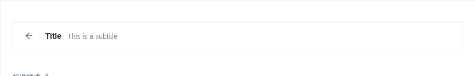
标准样式
标准页头,适合使用在需要简单描述的场景。
import { PageHeader } from 'antd';ReactDOM.render(<PageHeader onBack={() => null} title="Title" subTitle="This is a subtitle" />,mountNode,);
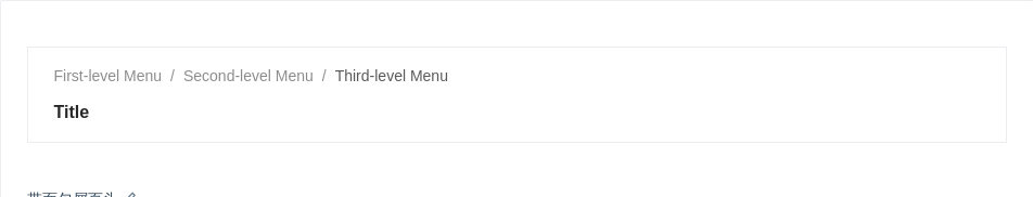
带面包屑页头
带面包屑页头,适合层级比较深的页面,让用户可以快速导航。
import { PageHeader } from 'antd';const routes = [{path: 'index',breadcrumbName: 'First-level Menu',},{path: 'first',breadcrumbName: 'Second-level Menu',},{path: 'second',breadcrumbName: 'Third-level Menu',},];ReactDOM.render(<PageHeader title="Title" breadcrumb={{ routes }} />, mountNode);
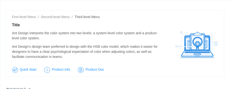
带内容的例子
带内容的例子,可以优先展示页面的主要信息。
import { PageHeader, Typography } from 'antd';const { Paragraph } = Typography;const routes = [{path: 'index',breadcrumbName: 'First-level Menu',},{path: 'first',breadcrumbName: 'Second-level Menu',},{path: 'second',breadcrumbName: 'Third-level Menu',},];const content = (<div className="content"><Paragraph>Ant Design interprets the color system into two levels: a system-level color system and aproduct-level color system.</Paragraph><Paragraph>Ant Design's design team preferred to design with the HSB color model, which makes iteasier for designers to have a clear psychological expectation of color when adjusting colors,as well as facilitate communication in teams.</Paragraph><p className="contentLink"><a><imgsrc="https://gw.alipayobjects.com/zos/rmsportal/MjEImQtenlyueSmVEfUD.svg"alt="start"/>Quick Start</a><a><img src="https://gw.alipayobjects.com/zos/rmsportal/NbuDUAuBlIApFuDvWiND.svg" alt="info" />Product Info</a><a><img src="https://gw.alipayobjects.com/zos/rmsportal/ohOEPSYdDTNnyMbGuyLb.svg" alt="doc" />Product Doc</a></p></div>);const extraContent = (<imgsrc="https://gw.alipayobjects.com/mdn/mpaas_user/afts/img/A*KsfVQbuLRlYAAAAAAAAAAABjAQAAAQ/original"alt="content"/>);ReactDOM.render(<PageHeader title="Title" breadcrumb={{ routes }}><div className="wrap"><div className="content">{content}</div><div className="extraContent">{extraContent}</div></div></PageHeader>,mountNode,);
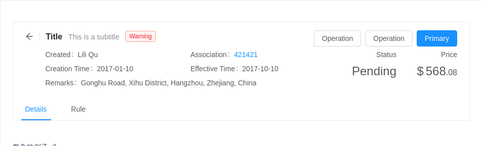
复杂的例子
使用操作区,并自定义子节点,适合使用在需要展示一些复杂的信息,帮助用户快速了解这个页面的信息和操作。
import { PageHeader, Tag, Tabs, Button, Statistic, Row, Col } from 'antd';const TabPane = Tabs.TabPane;const Description = ({ term, children, span = 12 }) => (<Col span={span}><div className="description"><div className="term">{term}</div><div className="detail">{children}</div></div></Col>);const content = (<Row><Description term="Created">Lili Qu</Description><Description term="Association"><a>421421</a></Description><Description term="Creation Time">2017-01-10</Description><Description term="Effective Time">2017-10-10</Description><Description term="Remarks" span={24}>Gonghu Road, Xihu District, Hangzhou, Zhejiang, China</Description></Row>);const extraContent = (<Row><Col span={12}><Statistic title="Status" value="Pending" /></Col><Col span={12}><Statistic title="Price" prefix="$" value={568.08} /></Col></Row>);ReactDOM.render(<PageHeaderonBack={() => window.history.back()}title="Title"subTitle="This is a subtitle"tags={<Tag color="red">Warning</Tag>}extra={[<Button key="3">Operation</Button>,<Button key="2">Operation</Button>,<Button key="1" type="primary">Primary</Button>,]}footer={<Tabs defaultActiveKey="1"><TabPane tab="Details" key="1" /><TabPane tab="Rule" key="2" /></Tabs>}><div className="wrap"><div className="content padding">{content}</div><div className="extraContent">{extraContent}</div></div></PageHeader>,mountNode,);
API
| 参数 | 说明 | 类型 | 默认值 |
|---|---|---|---|
| title | 自定义标题文字 | ReactNode | - |
| subTitle | 自定义的二级标题文字 | ReactNode | - |
| backIcon | 自定义 back icon ,如果为 false 不渲染 back icon | ReactNode | <Icon type="arrow-left" /> |
| tags | title 旁的 tag 列表 | Tag[] | Tag | - |
| extra | 操作区,位于 title 行的行尾 | ReactNode | - |
| breadcrumb | 面包屑的配置 | breadcrumb | - |
| footer | PageHeader 的页脚,一般用于渲染 TabBar | ReactNode | - |
| onBack | 返回按钮的点击事件 | ()=>void | ()=>history.back() |
